How can I compare website fonts with free tools?
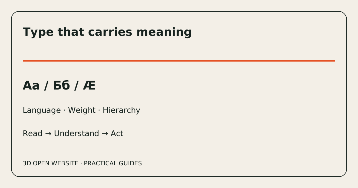
Use Google Fonts to shortlist and preview type, then test the same content in a realistic page. Keep the comparison small and controlled: three candidates with identical wording, colour, width and hierarchy reveal more than an endless gallery of unrelated samples.
Build a comparison sheet
Write columns for family, source, licence, required scripts, body weight, heading weight, italic, observed failures and decision. Add the date and exact file version where available. Use your own headline, paragraph, price and longest button. Include every language at the start; an English-only shortlist can waste the review.
Run the free workflow
- Search the Google Fonts catalogue for candidates and inspect their script coverage. Paste the same specimen into the preview.
- Compare regular and heavier styles at the intended body size, not only in giant display text.
- Use a local HTML page or your design tool's available free tier to put each candidate into the same service section and form.
- Inspect the rendered font in the browser; note fallback glyphs rather than assuming the preview and production files are identical.
- Check contrast in WebAIM and loading behaviour in Chrome's Network panel. Compare on a phone and at enlarged text size.
- Give readers the same task and record what they misunderstand. Ask about visual preference afterwards.
What evidence should decide the shortlist?
Reject missing required characters, clipped text and unreadable controls before considering personality. Then compare tone, density, maintenance and download cost. A variable font is not automatically smaller than the few static files you actually need; compare transferred bytes for the real configuration. Keep licensing evidence with the chosen assets.
A simple review result
A useful decision might read: candidate A passes Bulgarian and English but its light weight is too faint on the chosen surface; candidate B has a suitable body style but breaks the longest mobile label; candidate C passes the tasks with fewer files. These are illustrative observations, not test results for named families. See how to assign type roles before final approval.
Ready to Start Your Project?
Discuss your audience, services and enquiry process with our studio.
Get in TouchRelated Posts
How do I choose fonts and colours for a multilingual website?
A practical font and colour selection process: language coverage, hierarchy, contrast, free previews and tests of real customer tasks.
How do I check Bulgarian Cyrillic in a website font?
Test local Cyrillic forms, diacritics, bold, italic and fallback fonts before approving a Bulgarian and English website.
How do I pair fonts without making a website cluttered?
Assign roles to headings, body copy, numbers and actions. Test one family first, then add a second only when it solves a real problem.